
Portfolio—Typography: Critical branding.
Flux

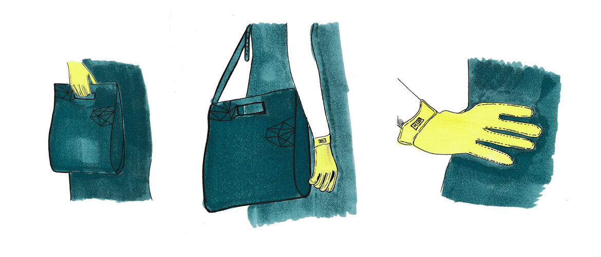
FLUX is a fictitious luxury brand, created in response to a critique of the commercial aviation industry. Re-thinking the way we travel, FLUX offers a new experience to a select clientele who is increasingly dissatisfied by overcrowding, intrusion of privacy and long waiting periods: a sleeping potion that allows door-to-door delivery of the guest. Guests may choose between the FLUX Potion, which may be added to a non-alcoholic drink or the FLUX Praliné, made by its trusted Swiss in-house chocolatier.
FLUX prides itself in its ability to provide its guests with a highly organised, and personalised service that focuses on their well-being prior, during and after the journey.
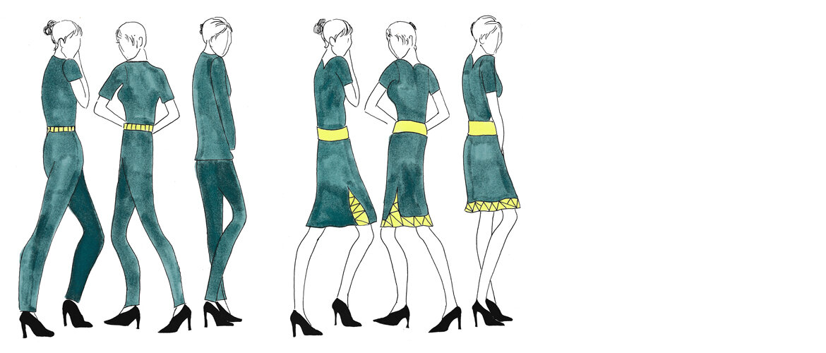
The logotype draws inspiration from the focus on a seamless customer experience through high quality service and attention to detail. This includes an aesthetically pleasing, modern, yet classic exterior, which is characterised by the use of extreme stroke contrast. The serifs, commonly seen in Didone typefaces, have been partially removed to allow the logotype to differentiate itself from a potential connection to the fashion industry, while additional kerning has been applied to reflect the brand’s luxurious traits.
The brand name is derived from "Flight" and "Luxury", while the FLUX colours, an elegant, dark sea green (“Arabesque”) and a contrasting, fresh and sporty yellow (“Polo”), have been selected to reflect the brand’s unique identity and focus on high quality service.
PROJECT TYPE
University Assignment
COMPLETED IN
2016
SKILLS
Brand Identity, Typography


Typography—Prosper White washed Book cover series Bloody Banana Bender Flux
Aviation—An Office With A View Safety first Boeing 737 overwing exit Sterile flight deck
Illustration—Creature Feature Forensic drawing
Design futures & collaboration—1501 steps Boro The Gift Heritage Defense Kit Water Inc.